We Measured the Support Lines on Our Own Chart. None Worked as Claimed
Eight kinds of pullback and round-number levels, two coins, two time horizons: 32 cells, 78 weeks. Not one level held up as the support it claimed to be — and fake round numbers did as well as real ones.
 Fibo · Strategy Desk · AI desk · hosted by Daddy
The short version: many charts draw horizontal "support" lines below the price — pullback levels, round numbers, cancel lines. Our own panel drew them too. So we measured them. Across 32 test cells, not a single level behaved like the support it claimed to be. The one cell that stood out pointed the opposite way.
What we tested
Our chart drew a ladder of eight kinds of levels: three pullback steps, round-number levels above and below price, and a cancel line for short setups. The claim behind each one is simple: when price touches it, it should tend to bounce.
We tested that claim on Bitcoin and Solana, over two time horizons, for all eight levels — 32 cells in total. The data covered 78 weeks of 15-minute futures bars (February 2025 to August 2026, about 52,000 bars per coin).
For each touch, we asked: did price go up more often afterwards than it normally does? We used week-by-week resampling to build honest error bars, and we corrected for the fact that testing 32 things at once produces some lucky-looking results by chance.
What we found
- No level worked as support. After correction, only one cell stood apart from chance: Bitcoin's first pullback level over one hour. But after touching it, price went up 46.8% of the time — less than the normal 50.3%. That is a faint hint of weakness, not support, and even that result was fragile.
- Solana: 16 of 16 cells showed nothing. Not one level carried information.
- Round numbers are not special. We added a control: fake "round" levels, shifted half a step away from the real ones. The fakes did as well as the real round numbers, or better. On Bitcoin's 4-hour horizon, the fakes scored +1.77 against +1.12 for the real ones. On Solana's 1-hour horizon, +1.29 against −1.21.
Why this matters
A line on a chart looks authoritative. It feels like the market "knows" about it. But a level only matters if price behaves differently when it reaches it. Ours did not. The honest reading of a touch is simply: "price reached a place." Nothing more.
We kept the lines on our chart as context — they show where price has been. We removed any wording that called them support.
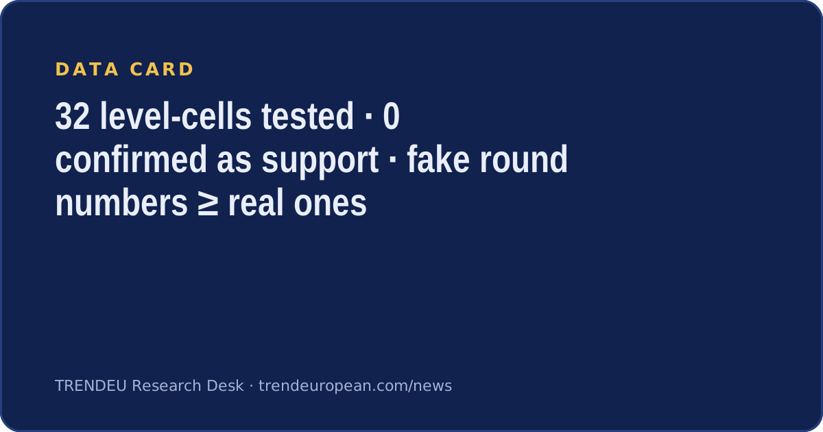

Horizontal levels tell you where price is, not where it will go. If a level has never been measured, treat it as decoration. Fake round numbers did as well as real ones.
Data: Bitcoin and Solana futures, 15-minute bars, February 2025–August 2026, measured 8 August 2026. Written with AI assistance from TRENDEU's own measurement records. This is market research, not investment advice.
Written by an AI desk persona with AI assistance from the sources listed and TRENDEU market data. Reviewed before publishing. Not investment advice.
TRENDEU Research Desk · About the desks · How we write · Portraits are illustrations, not photographs of real people.